What is shadcn/ui?
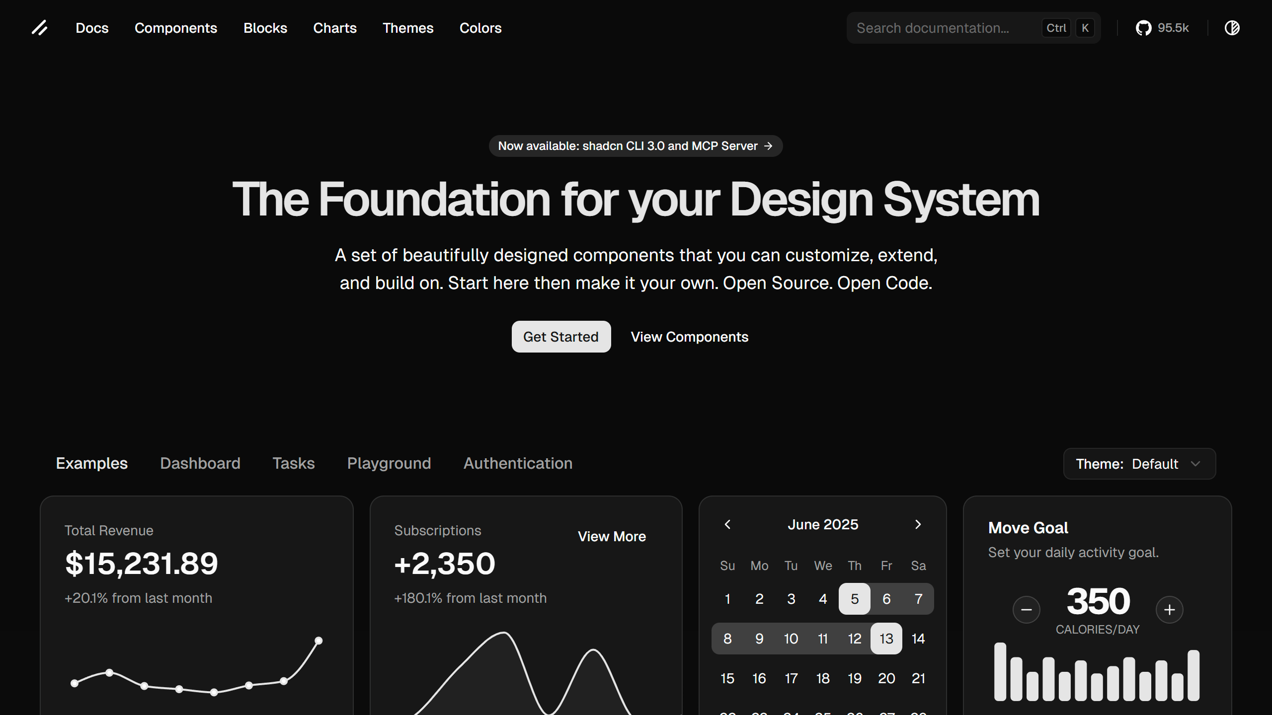
Picture this: a component library that doesn't trap you in a rigid design system or force you to install huge dependencies. That's exactly what shadcn/ui offers. It's not your run-of-the-mill component library, it's a fresh approach to building modern React apps that gives you full control over your codebase while still providing access to beautifully designed, production-ready components.
Created by the folks at Vercel and drawing inspiration from Radix UI and Tailwind CSS, shadcn/ui takes a completely different approach to component libraries. Rather than installing components as dependencies, you simply copy and paste the source code straight into your project. This means you own every single line of code, can tweak everything however you want, and never have to stress about version conflicts or breaking changes from external dependencies.
The library comes with over 50 carefully crafted components that cover everything from simple buttons and inputs to complex data tables and navigation menus. Each component is built with accessibility in mind, follows modern React patterns, and includes full TypeScript support. It's like having a team of expert designers and developers build your component library for you, but you get to keep all the source code and make it completely yours.
Why shadcn/ui is Changing the Game
In a world where component libraries often come with strings attached, vendor lock-in, design constraints, and dependency hell, shadcn/ui is like a breath of fresh air. The traditional approach of installing component libraries as npm packages has worked well for us, but it comes with some real limitations that shadcn/ui solves in a clever way.
The copy-paste approach might seem a bit unusual at first, but it's actually pretty brilliant. When you copy a component into your project, you're not just getting a black box, you're getting the actual source code. This means you can read it, understand it, modify it, and even contribute improvements back to the community. It's open source in the truest sense: not just free to use, but free to own and modify.
This approach also gets rid of the dreaded "dependency hell" that troubles many React projects. No more worrying about version conflicts between different component libraries, no more waiting around for updates to fix critical bugs, and no more being stuck with outdated components because upgrading would break your entire application. With shadcn/ui, you're in complete control.
But what really makes shadcn/ui special is its commitment to modern web standards and accessibility. Every component is built on top of Radix UI primitives, which means you get battle-tested accessibility features right out of the box. Keyboard navigation, screen reader support, focus management, and ARIA attributes are all handled automatically, so you can focus on building great user experiences instead of fighting with accessibility requirements.
Getting Started is Surprisingly Simple
Despite its innovative approach, getting started with shadcn/ui is surprisingly straightforward. The team has created a great CLI tool that handles all the heavy lifting, from setting up your project configuration to installing components with a single command. Whether you're starting a new project or adding shadcn/ui to an existing one, the process is designed to be as smooth as possible.
Initial Setup with the CLI
The shadcn/ui CLI is your entry point to the entire ecosystem. It handles everything from project initialization to component installation, making the whole process seamless. To get started, you'll first need to initialize shadcn/ui in your project:
# Install the CLI globally
npm install -g shadcn-ui@latest

# Initialize shadcn/ui in your project
npx shadcn-ui@latest init
The init command will guide you through a series of questions to configure your project. It will ask about your preferred styling solution (CSS variables or Tailwind), your color scheme, and where you'd like components to be installed. The CLI is smart enough to detect your existing setup and will configure everything accordingly.
Installing Your First Component
Once initialized, installing components is as easy as running a single command. The CLI will copy the component source code into your project and handle all the necessary imports and dependencies:
# Install a button component
npx shadcn-ui@latest add button

# Install multiple components at once
npx shadcn-ui@latest add button card input
Manual Installation for Full Control
If you prefer to have complete control over the installation process, you can also install components manually. Each component's source code is available on the shadcn/ui website, and you can copy it directly into your project. This approach lets you review the code before adding it and make any modifications you need right from the start.
The shadcn Sidebar: A Perfect Example
One of the most impressive components in the shadcn/ui library is the Sidebar component, which perfectly shows off the power and flexibility of the entire system. Sidebars are notoriously complex to build from scratch, they need to handle collapsible states, responsive behavior, keyboard navigation, and accessibility requirements. The shadcn Sidebar component handles all of this complexity while staying incredibly customizable.
The Sidebar component is built using a composable architecture that makes it both powerful and flexible. Instead
of being a monolithic component with limited customization options, it's made up of several smaller, focused
components that work together seamlessly. This includes the SidebarProvider for state
management,
SidebarContent for the
main content area, SidebarHeader and SidebarFooter for sticky
sections, and
SidebarMenu for
navigation items.
What makes the shadcn Sidebar particularly impressive is its built-in support for different collapsible modes. You can have a sidebar that collapses to icons, one that slides in and out, or one that keeps its full width. The component handles all the complex state management and animations automatically, while still giving you complete control over the styling and behavior.
The accessibility features are equally impressive. The Sidebar component includes proper ARIA attributes, keyboard
navigation support, and focus management that works seamlessly with screen readers. It also includes a
SidebarTrigger
component that automatically handles the toggle functionality and maintains proper accessibility
relationships.
Here's a simple example of how you might use the shadcn Sidebar in your application:
import { SidebarProvider, SidebarTrigger } from "@/components/ui/sidebar"
import { AppSidebar } from "@/components/app-sidebar"

export default function Layout({ children }: { children: React.ReactNode }) {
  return (
    <SidebarProvider>
      <AppSidebar />
      <main>
        <SidebarTrigger />
        {children}
      </main>
    </SidebarProvider>
  )
}
The beauty of this approach is that you can see exactly how the Sidebar works, modify it to fit your specific needs, and even extend it with additional functionality. If you need a sidebar that behaves differently from the default implementation, you can easily modify the source code to match your requirements.
For an even simpler sidebar solution, you can use the sidenav from Axentix.
The Technical Foundation That Powers Everything
Under the hood, shadcn/ui is built on a solid technical foundation that makes it both powerful and reliable. The components are built using modern React patterns, including hooks for state management and context for sharing state between components. This ensures that the components are not only performant but also follow React best practices.
Radix UI Primitives
Every shadcn/ui component is built on top of Radix UI primitives, which provide the underlying functionality and accessibility features. Radix UI is a low-level UI primitive library that handles all the complex accessibility requirements, keyboard navigation, and focus management that make components truly usable. By building on top of these primitives, shadcn/ui components inherit all of these benefits while providing a more developer-friendly API.
Tailwind CSS Integration
The styling system is built around Tailwind CSS, which provides a utility-first approach to styling that's both powerful and maintainable. Each component comes with carefully crafted Tailwind classes that create beautiful, consistent designs. The use of CSS variables for theming means you can easily customize colors, spacing, and other design tokens to match your brand.
TypeScript Support
Every component comes with comprehensive TypeScript support, including proper type definitions for all props and return values. This means you get excellent IDE support, compile-time error checking, and better documentation through your code editor. The TypeScript integration is so thorough that you'll rarely need to look at external documentation while developing.
Modern React Patterns
The components use modern React patterns like hooks, context, and compound components. This makes them both powerful and easy to understand. The use of compound components (like the Sidebar example above) allows for flexible composition while maintaining a clean API. Hooks are used for state management and side effects, making the components both performant and easy to test.
Why shadcn/ui Matters for Modern Development
In today's fast-paced development environment, the ability to move quickly while maintaining high quality is more important than ever. shadcn/ui addresses this need by providing a perfect balance between speed and flexibility. You can get started quickly with beautiful, production-ready components, but you're never locked into a specific design or implementation.
The Copy-Paste Revolution
The copy-paste approach might seem like a step backward in an age of sophisticated package managers and dependency management tools, but it's actually a step forward. By copying source code into your project, you eliminate the complexity of managing external dependencies while gaining complete control over your codebase. This approach is particularly valuable in enterprise environments where security and compliance requirements make external dependencies problematic.
Design System Flexibility
Unlike traditional component libraries that force you into a specific design system, shadcn/ui gives you the freedom to create your own. The components are designed to be customizable, with CSS variables for theming and Tailwind classes for styling. This means you can adapt the components to match your brand while still benefiting from the underlying functionality and accessibility features.
Performance and Bundle Size
Since you only copy the components you actually use, your bundle size stays lean. There's no need to include an entire component library when you only need a few components. This approach also eliminates the risk of unused code being included in your bundle, which can significantly impact performance, especially on mobile devices.
Future-Proof Development
The copy-paste approach also makes your codebase more future-proof. You're not dependent on external maintainers to fix bugs or add features. If you need a component to behave differently, you can modify it directly. If you need to add new functionality, you can extend the existing components. This level of control is invaluable for long-term project maintenance.
The Ecosystem and Community
One of the most impressive aspects of shadcn/ui is the vibrant ecosystem that has grown around it. The community has created hundreds of additional components, examples, and integrations that extend the core library. From complex data tables to sophisticated form builders, there's likely a community-contributed component that meets your needs.
The shadcn/ui website itself is a treasure trove of examples and inspiration. The Blocks section showcases real-world applications built with the components, from simple landing pages to complex dashboards. These examples not only demonstrate what's possible but also provide practical code that you can adapt for your own projects.
The community is also incredibly active and helpful. The Discord server is a great place to get help, share your creations, and learn from other developers. The GitHub repository is well-maintained with regular updates, bug fixes, and new components. The maintainers are responsive to issues and feature requests, making it clear that this is a project that's here to stay.
Ready to Transform Your Development Workflow?
shadcn/ui represents a fundamental shift in how we think about component libraries. It's not just another UI framework, it's a new way of building applications that puts developers in control while providing access to world-class components and design systems.
Whether you're building a simple landing page or a complex enterprise application, shadcn/ui provides the tools you need to create beautiful, accessible, and maintainable user interfaces. The combination of modern React patterns, comprehensive accessibility support, and complete customization freedom makes it an excellent choice for projects of any size or complexity.
The best way to understand the power of shadcn/ui is to try it for yourself. Start with a simple component like a button or card, and you'll quickly see how the copy-paste approach gives you complete control while still providing professional-quality results. As you explore more complex components like the Sidebar or Data Table, you'll appreciate the thoughtful architecture and attention to detail that makes shadcn/ui special.
So what are you waiting for? Visit the shadcn/ui website today and start building with components that are truly yours. Your users will love the polished interfaces, your team will appreciate the maintainable code, and you'll wonder how you ever built React applications without it.


