You build a layout, it looks right, you ship it. Then a bug report arrives with a screenshot where the sidebar has collapsed a breakpoint early, or the dark theme that looked deep black on your laptop is washed-out grey on someone's office monitor.
Neither one is a CSS bug. The screen you develop on isn't the screen anyone else has, and the number printed on your monitor's box isn't the number the browser works with.
Your viewport is not your resolution
A monitor sold as 1920×1080 almost never gives you 1920 CSS pixels to lay out in. Windows ships most laptops at 125% or 150% scaling, macOS runs Retina displays at a fractional scale, and the browser divides physical pixels by that factor before your media queries ever see them.
The browser exposes three numbers, and they rarely match:
console.log(screen.width, screen.height);        // physical screen, in device pixels
console.log(window.innerWidth, window.innerHeight); // viewport, in CSS pixels
console.log(window.devicePixelRatio);            // ratio between the two
Run that on a 1080p monitor at 125% scaling and you get 1920 from screen.width, roughly 1536
from window.innerWidth,
and
1.25 as the ratio. Your media queries respond to the middle number. The one on the box is irrelevant.
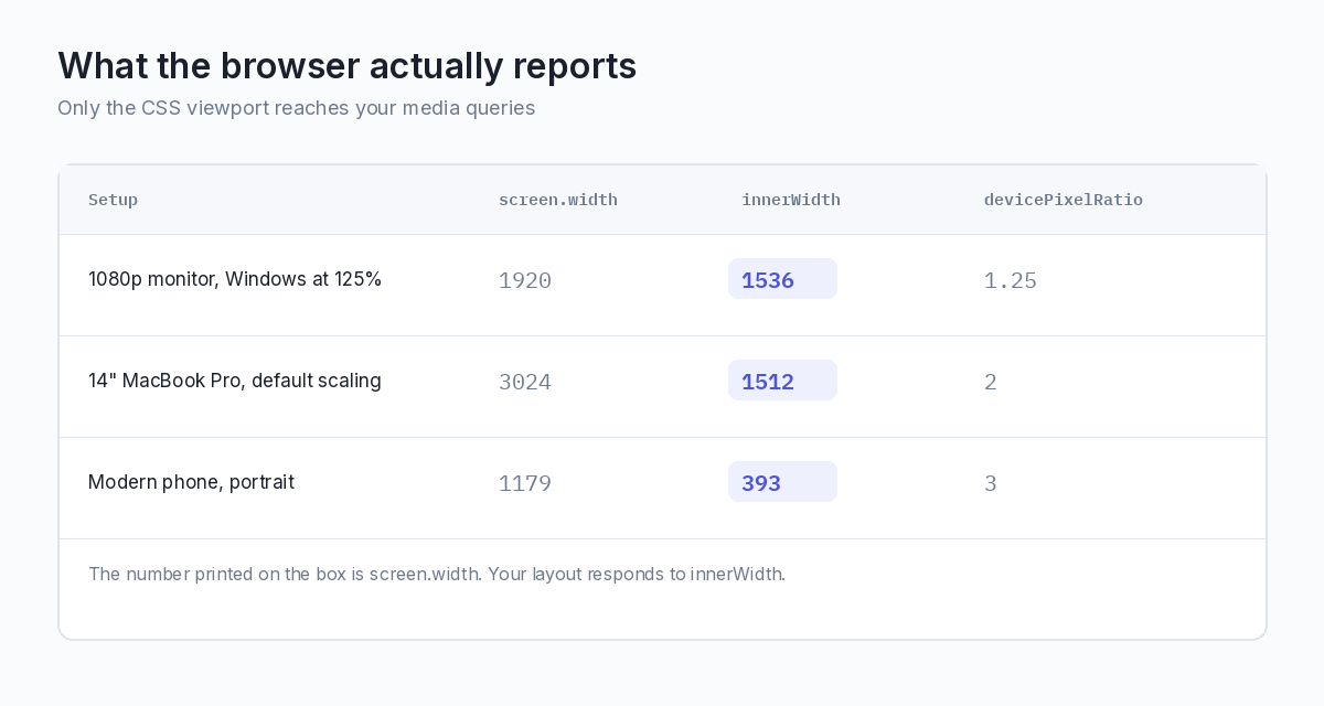
This is why the "1536px problem" keeps appearing in analytics: a large share of desktop users sit just below a 1536 or 1600 breakpoint without owning anything close to a small screen. If your layout switches to a tablet arrangement there, a lot of people on perfectly wide monitors get the wrong one.
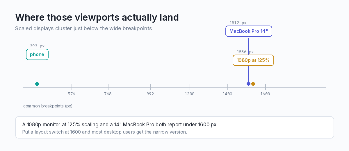
Set breakpoints from real numbers
So check what your own users report rather than what device spec sheets say. Analytics that log viewport width instead of screen resolution show the clusters, and they usually sit at scaled values like 1536, 1280, 1366 and 1194, not the round numbers in framework defaults.
Two things worth doing while you build:
- Keep the viewport size visible. Devtools shows it while resizing, and a one-line overlay during development
costs nothing:
<div id="vp" style="position:fixed;bottom:0;right:0;z-index:9999; padding:4px 8px;background:#111;color:#fff;font:12px monospace"></div> <script> const vp = document.getElementById('vp'); const show = () => vp.textContent = `${window.innerWidth}×${window.innerHeight} @${window.devicePixelRatio}`; show(); addEventListener('resize', show); </script> - Test at browser zoom levels other than 100%. Zooming changes the CSS viewport, so a user at 110% zoom on a
wide monitor hits the same breakpoints as someone on a narrower screen. Layouts built on
remand relative units survive this; ones pinned to pixel widths don't.
Check the panel before you trust it
The display itself is the other half of the problem. Before deciding anything about contrast, a gradient or how your dark theme reads, find out whether the monitor you're looking at is accurate.
Two faults matter here, and a full-screen block of one colour reveals both.
Dead and stuck pixels. A dead pixel stays black on every colour; a stuck one shows the same colour regardless of what's sent to it. Cycle through solid white, black, red, green and blue at full screen and they become obvious. Against a busy UI you'll never spot them, and you can lose an afternoon debugging a rendering artefact that turns out to be hardware.
Backlight bleed and uniformity. On a solid black screen in a dark room, most IPS panels glow at the corners. That glow is why a dark theme can look fine to you and muddy to a colleague: you aren't seeing the same black. Solid mid-grey shows the opposite problem: uneven brightness across the panel, which makes subtle background steps in a design look intentional on one screen and broken on another.
Browser-based tools are the quickest route, since the test needs to fill the screen with nothing around it. The full-screen white and black screens on BlankScreen run in a tab and go fullscreen with one key, and the same site has the colour cycles and a dead pixel test. Nothing to install, and it works on whatever machine you're at, including a colleague's when you're reproducing their report.
Dark mode depends on the panel more than the CSS
Pure black is not the same colour on OLED and IPS, and that affects what you should ship.
On OLED, a pixel set to #000 is switched off.
Black is absolutely black, and pure-white text on it produces enough contrast to cause visible halation around
the glyphs; the text seems to bloom. Designers who work on OLED often pull white text back to something like
#e8e8e8 because of it.
On IPS, that same #000
is a backlight
shining through a closed shutter. It reads as dark grey, the corners glow, and a theme built around near-black
surfaces loses the separation between layers, so your elevated card and your background end up the same colour.
So a dark theme designed only on a MacBook looks flat on the office IPS monitor, and one designed only on IPS
blooms on a phone. Test on both, and prefer distinguishable surface steps (say #121212 for background and
#1e1e1e for raised
surfaces) over pure black, which collapses on one technology and blooms on the other.
Also check that the theme follows the system preference instead of guessing:
@media (prefers-color-scheme: dark) {
  :root { --surface: #121212; --surface-raised: #1e1e1e; --text: #e8e8e8; }
}
And confirm the switch happens when the OS setting changes while the page is open. A theme applied once at load and never again is a common miss.
A short pre-ship checklist
- Log
innerWidthanddevicePixelRatioon every machine you test on, and note where they fall relative to your breakpoints. - Resize slowly through every breakpoint rather than jumping between preset sizes; the broken states hide in between.
- Test at 110% and 125% browser zoom, not only 100%.
- Check the panel for dead pixels and bleed before judging any colour decision.
- Look at the dark theme on at least one OLED and one IPS screen.
- Verify the theme responds to a live change of the system colour scheme.
These checks take a few minutes and catch the bugs you can't debug from a screenshot, where the CSS is correct and the screen is the variable. For how the browser arrives at those numbers, MDN's reference on devicePixelRatio explains the maths.