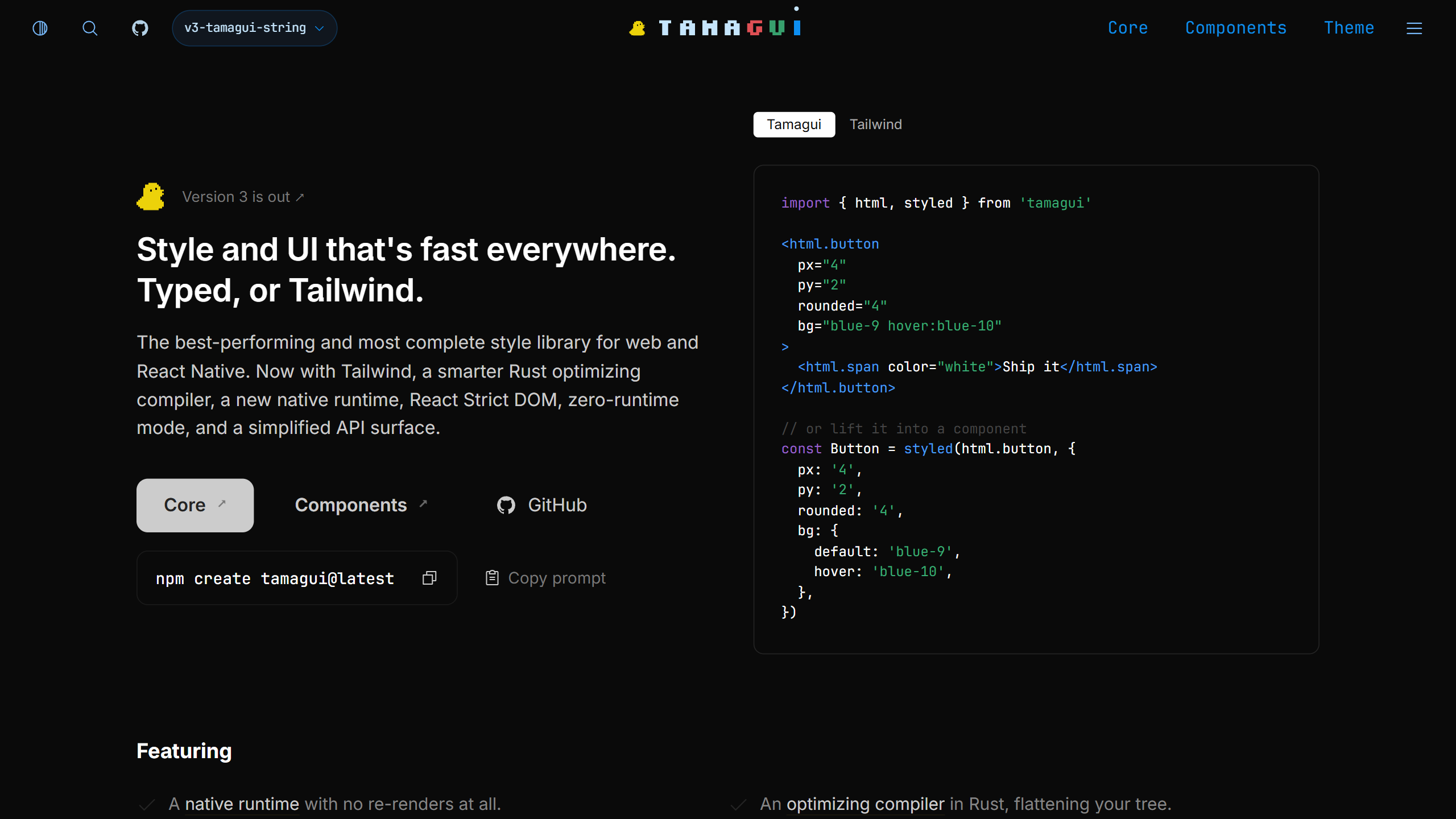
Flat Style Props
This is the change you will notice first. A prop now holds its base value and all its conditions in one place,
so you no longer need separate hoverStyle or media
props. Modifiers chain with colons, like dark:sm:hover.
<View bg="background hover:background-hover" p="4 sm:6" />

const Card = styled(View, {
  bg: 'background hover:background-hover',
  p: '4 sm:6',
  scale: { press: 0.98 },
})
String and object forms compile to the same CSS. You can restrict your project to one of them with settings.styleValueSyntax.
Native Runtime and Compiler
- Native style runtime (opt-in beta):
@tamagui/native-registryapplies theme changes directly to Fabric views, without a React re-render. It needs React Native 0.82+ with the New Architecture, Nitro Modules andexperimental.nativeFastPath. - Smarter compiler: it now flattens nested ternaries, logical conditions, static spreads,
styled.dynamic()variants and.resolve()chains when values are known at build time. - Zero-runtime on web (experimental):
experimental.zeroRuntime: 'report'shows what could be extracted to static CSS.
Tailwind and React Strict DOM
@tamagui/tailwind
exports html
elements that accept Tailwind classes. They compile to atomic CSS on web and to React Native styles on mobile.
import { html } from '@tamagui/tailwind'

<html.div className="flex flex-row items-center gap-3 p-4 rounded-lg bg-slate-100" />
Other Notable Additions
- Config v6: multi-word theme keys are now kebab-case (
border-color,background-hover). - Language server:
@tamagui/lspgives completions, diagnostics, per-theme hover and color swatches in any LSP editor. - Forms: new
FieldandFormprimitives with validation through Zod 4, Valibot or ArkType. - Select: multi-select with
multipleand a newSelect.Separator. - Icons:
npx @tamagui/cli icons addgenerates only the icons you use. The bundled Lucide package (around 1700 icons) is gone. - Tooling:
@tamagui/cli/viteand@tamagui/cli/metroreplace the separate bundler plugins.
Breaking Changes
$truetokens are replaced by named sizes fromxstoxl(defaultmd), and token stepping is removed.- Half-step tokens are renamed:
$0.5becomes0-5. - Removed props:
focusable(usetabIndex),fullscreen,themeInverse(usetheme="inverse"). - Removed hooks and APIs:
useProps,usePropsAndStyle,styleableanddefaultPropsincreateTamagui. Sheet.Frameis split intoSheet.ContainerandSheet.Background.onDidAnimateis replaced byonTransition.
How to Upgrade to Tamagui 3
The CLI does most of the work. Run the codemod in report mode first to review what it will change.
# New project
yarn dlx @tamagui/cli setup

# Existing project (use --from v1 if you are still on v1)
yarn dlx @tamagui/cli migrate --from v2
yarn dlx tamagui check
yarn dlx @tamagui/codemod-flat-values --write --report flat-values-report.md ./src
Then add tamagui check --strict
to your CI. If you use native safe areas, place SafeAreaProvider outside
TamaguiProvider.
Should You Upgrade?
For a new project, yes. For an existing app, the migration tooling is solid but the token and prop removals touch a lot of files, so plan a dedicated branch. The native runtime is still a beta, so you can upgrade to Tamagui 3 now and enable it later. New to the library? Start with our guide on what Tamagui is and how to use it.